It's all a matter of experience. Like a successful trip forever memorable for being a good experience – that is exactly how a good experience is retained in one's consciousness in the virtual world. It is also important to remember that a pleasant experience, not only quality content – is what leaves an average surfer longer than 7 seconds on the page he is in.
The components of the experience
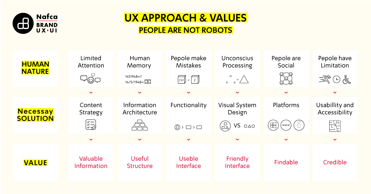
For the experience to be an excellent one, it is important to have these four parameters:
-
Easy – easy to use, easy to understand, easy to learn
-
Effective – allows me to complete a task that I see as valuable
-
Esthetic – pleasant to look at, comfortable, inviting and approachable
-
Fun
Sounds complicated? Maybe a little, but it sure is an experiential journey.
The G-spot of User Experience
The user experience is that little spot that connects: customer needs and business needs. But, just like on the search for the G-spot – you need to know how to get there. The way: to bravely ask the right questions and only then embark on the journey. You also want to enjoy the road, don't you?
The right questions: who is the company? Who is the competition? What is the goal of the interface? Who is the target audience? What are the business goals and criteria for success?

Persona Model
A persona is a fictional character that does not exist in real life and which we, the UX people, use as a tool to represent a section of the population with similar characteristics. The persona is constructed using the preliminary data we collect about users and by using the market segmentation and target audience parameters we receive from the business definitions.
Usage scenarios
Usage scenarios form a kind of "path" describing the user interaction within the system. The steps, the events, the actions, and the decisions – take their place when the scenario is being built, while referring to the persona characteristics we defined earlier.
Planning screens – sharpen your pencils
It's good we've reached this far. It means we are together, understand the flow chart, and everything is in order for us – now it is time to write it down all neat and organised.
We start by dividing the screen, and then continue to set a navigation model, priorite according to information importance, and set the visual presentation – colorfulness and accessibility.
Navigation model – where am I?
Users use the navigation as an anchor. Through it, they can come in and discover contents, products and topics inside the interface in a free and easy way that suits their needs. To make it easy for them to wander around, we need uniformity for the purpose of orientation, the existence of a Search option, and of course, intuitive information hierarchy.
What do we see?
It is highly recommended to consider, already during the planning stage, the human visual perception. It ultimately works for our interface. Just the way our eye distinguishes between focused and peripheral vision than attention to colours, movement, emphasis on visual elements and accessibility (colour blindness, cognitive matters, etc.) should be accounted for during the planning stage.
Sounds complicated? Maybe a little, but it sure is an experiential journey.


